In this article, you will get to know Top Google Fonts For Blogging.
As I embark on my blogging journey, I’ve come to realize the significance of aesthetics in capturing readers’ attention and keeping them immersed in my content.
Font selection is something that a lot of blog owners neglect to consider when it comes to setting up their sites.
This is especially harmful in today’s world since most readers are visual.
Blogging is my favorite side hustle, and I go into great detail about it in my free income-boosting course.
Even if your content is excellent, picking the appropriate typeface might mean the difference between high reader retention and high bounce rates.
When it comes to traffic, what you say is just as essential as how you say it, and picking the appropriate font is crucial.
Throughout this guide, I’ll be delving into a curated collection of top Google Fonts that I believe can truly transform my blogging experience.
Let’s take a closer look at the significance of fonts in blogging.
Importance of Fonts in blogging 2024?
Fonts are important in blogging because they play a significant role in the overall readability and user experience of your content. Here are some reasons why fonts are important in blogging:

- Legibility: The font you choose should be easy to read, with a clear distinction between letters and words. A legible font ensures that your readers can easily read and understand your content.
- Branding: The font you choose can also help you establish a strong brand identity for your blog. By choosing a font that aligns with your blog’s theme and message, you can create a unique and memorable brand that resonates with your readers.
- Tone and style: The font you choose can also convey a particular tone or style to your content. For example, a bold, sans-serif font can create a modern and sleek look, while a more traditional serif font can convey a classic and sophisticated tone.
- Consistency: Using consistent fonts throughout your blog can help create a cohesive look and feel, making it easier for readers to navigate and engage with your content.
Overall, fonts are a crucial aspect of blogging that can affect the readability, branding, tone, and consistency of your content.
Therefore, it’s important to choose fonts that enhance the user experience and align with your blog’s messaging and branding.
How can a font help with readability?
It’s no wonder that the world’s most prestigious newspapers chose their font styles with care and intention.
The smallest detail can readily distinguish a professional website from an amateur blog for today’s discerning readers, and your font choice is one of the most evident factors.
Here are the reasons why selecting the proper font for a blog is critical to readability.
Top 10 Google Fonts for Blogging 2024
Despite the fact that there are over 200,000 fonts to choose from, I’ll be focusing on the finest Google fonts for blogs for a variety of reasons.
Aside from being free for commercial use, consumers will not face any licensing issues.
Font embedding will be a breeze with these fonts because they are so simple to use on websites.
Using Google fonts also improves the speed with which your page loads. For significantly faster loading times, combine your Google font choice with a web server that employs Cloudflare CDN, such as Bluehost.
On the Google Fonts page, you can download any of the fonts mentioned below.
1. Roboto
Roboto is by far the most popular Google Font in terms of downloads and installations. The reason behind this is that it has a geometric, yet approachable, design.
It delivers a natural, fluid reading experience as well as the professionalism that most writing requires.

2. Oswald
Oswald is a basic blogger font that is both attractive and readable.
It’s a reinterpretation of a traditional design that works well for body content and article headings.
Oswald is a typeface that goes well with Roboto and Lato. It comes in six different styles.

3. Open Sans
Open Sans is my favorite font to use on a blog or website, and it was designed by Steve Matteson. It has a clean appearance and is well-suited to print, online, and mobile platforms.
Open Sans, which comes in ten distinct styles, is ideally suited for headings but may also be utilized for body text without issue.
It also goes well with Oswald and Montserrat.

4. Raleway
Raleway is a graceful typeface that is both easy on the eyes and professional. It comes in 18 distinct designs and is designed for large-scale applications such as headers and page titles.
When used with Raleway, Open Sans and Josefin Slab look fantastic.

5. Ubuntu
Ubuntu is the font used by the popular open-source operating system of the same name, as you may have guessed. It features edgy edges that are ideal for technology-focused websites and blogs.
Ubuntu is a font that comes in eight distinct weights and is ideal for text bodies and visual design.
It also looks well with Open Sans and Oswald for a professional but beautiful look.

You may also read
- Best WP Rocket Alternatives
- Sara Davis | VP Of Growth @CanIRank Explains How To Rank on Google
- Best WordPress Magazine Themes For Travel Sites
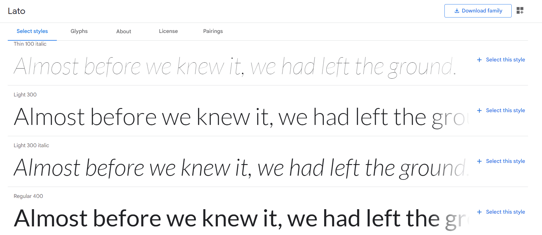
6. Lato
Lato is a vintage font that goes nicely with virtually every blog font on this website.
It was created by Ukasz Dziedzic in 2010 and has since become extensively used. More than 8,600,000 websites use it at the moment.
It’s a great font for article bodies because of its simplicity and readability, and it comes in ten distinct styles. Open Sans and Raleway go well with Lato.
7. Source Sans Pro
As you may have observed, Source Sans Pro is a typeface that works well with the rest of the Google fonts on our list.
Paul D. Hunt developed Adobe’s first open-source font family.
Source Sans Pro, which comes in ten distinct styles, may be used everywhere on the page and yet look good. It’s also one of the most used Google web fonts, with over 4,200,000 websites using it.

8. PT Sans
PT Sans was created for the project “Public Types of Russian Federation” and is based on Russian sans serif types.
It is extensively used and popularly used for headers and page titles, and it is influenced by Russian history.
The font comes in eight different styles and is frequently used in combination with Roboto and PT Serif (same family).

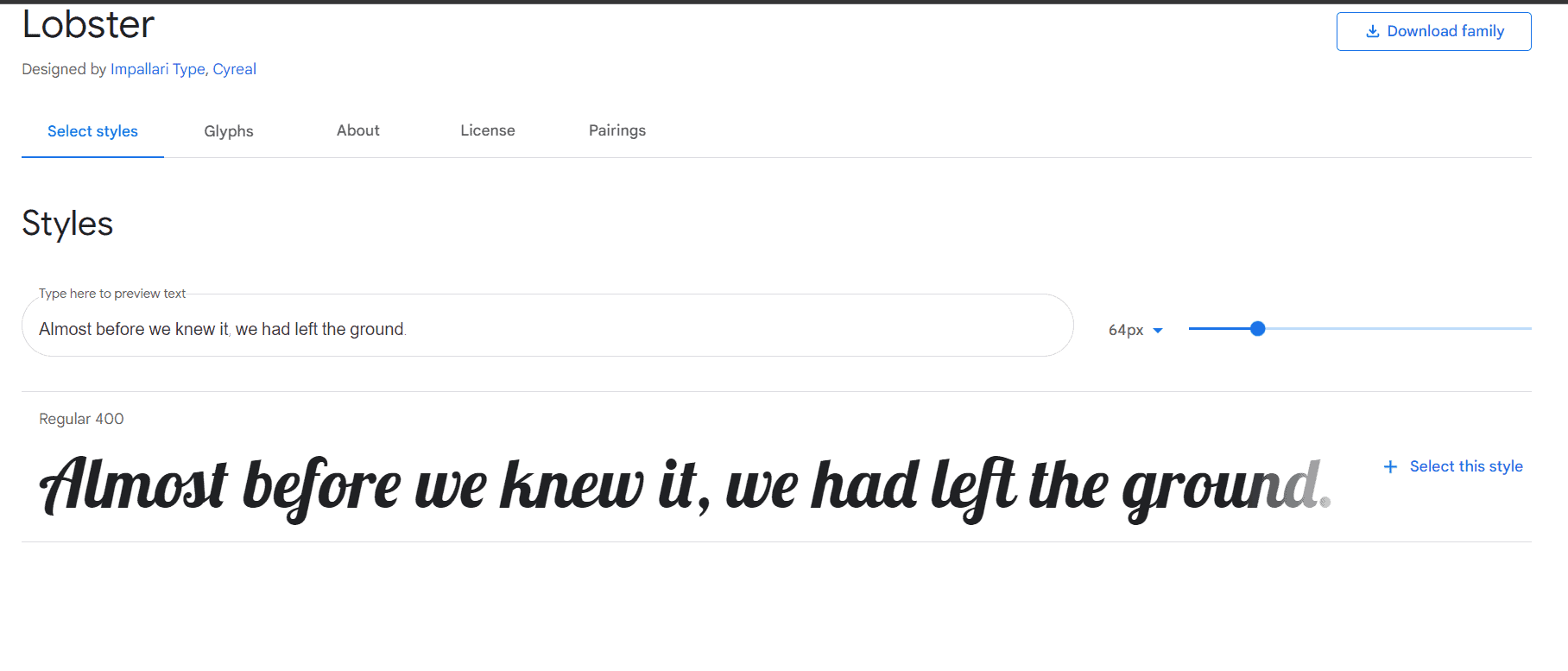
9. Lobster
Lobster is another popular fancy theme that is great for visuals but not so much for the content of the post.
Lobster is a difficult-to-see font because of its complexion, which necessitates straining the eyes to read some phrases.
Lobster, on the other hand, is a wonderful choice for fun-filled writing headers (assuming they aren’t too lengthy).
Only one style is available, and it works well with Raleway and Josefin Slab fonts.
10. Lora
This font is ideal for writing essays. Lora is a well-known and one of the greatest free Google fonts. It features brushed contours that make it look both attractive and elegant.
It simply comes in four styles, which are plenty for narrative authoring.
Lora looks best when used with Open Sans and Lato. Lora appears to be a good fit for the article body on the web.

FAQ’S On Fonts For Blogging
Why is font selection important for blogging?
Font selection is crucial for blogging because it significantly impacts the readability and aesthetics of your content. Choosing the right fonts can enhance the overall user experience, make your blog visually appealing, and complement your blog's branding and style.
What are the best fonts for blogging?
The best fonts for blogging are typically clean, easy to read, and versatile. Some popular and widely used fonts include Arial, Helvetica, Georgia, Times New Roman, Open Sans, Roboto, and Lato. These fonts are considered safe choices as they are widely available on different devices and operating systems.
Can I use decorative fonts for my blog?
Using decorative fonts sparingly and for special elements like headlines or logos can add visual interest to your blog. However, it's essential to prioritize readability, so avoid using decorative fonts for large bodies of text, as they can be challenging to read.
Should I use serif or sans-serif fonts for blogging?
Both serif and sans-serif fonts can work well for blogging, depending on your blog's theme and content style. Sans-serif fonts like Arial and Helvetica are often preferred for online content due to their clean and modern appearance, while serif fonts like Georgia and Times New Roman can add a touch of elegance and formality.
How many fonts should I use on my blog?
Using too many fonts can make your blog look cluttered and unprofessional. It's generally recommended to stick to two or three fonts—one for headings and another for body text. Keeping the font choices consistent helps maintain a cohesive and visually appealing design.
Can I use custom fonts on my blog?
Yes, many blogging platforms and website builders allow you to use custom fonts. You can upload and use custom font files or utilize web font services like Google Fonts, Adobe Fonts, or Typekit. Just ensure that the custom fonts you choose are web-safe and accessible to your audience.
Are there any accessibility considerations for font selection?
Absolutely! Accessibility is essential for a broader audience reach. When choosing fonts, ensure they are legible and easy to read, especially for people with visual impairments. Select fonts with adequate contrast against the background and consider font size and line spacing for better readability.
How do I know if my chosen font is web-safe?
To ensure your font is web-safe, use commonly available fonts like Arial, Helvetica, Times New Roman, and Verdana. Alternatively, you can use web font services that provide a wide range of fonts that are designed to be accessible across different devices and browsers.
Quick Links
- Blogging Tips from the Best Bloggers
- How To Optimize Old Articles For Google Featured Snippets?
- How To Make More Money From Blogging Upto
- Top Best Free Blogging Sites List To Create Blogs
- Do You Make These HTML Coding Mistakes in Blogging ?
Final Thoughts | Top Google Fonts For Blogging 2024
To wrap it up, the process of selecting Google Fonts for your blog is an exciting opportunity to infuse your personal touch into its design.
The readability of your content can impact the user experience of your site, which can lead to a higher bounce rate and less time spent on the site.
Choosing a decent font may not appear to be a critical chore at first, but as you begin to focus on blog analytics, you will realize its value.
Regardless of whether you’re aiming for a contemporary edge or a timeless charm, there’s a Google Font waiting to be your blog’s perfect companion.
What font do you use on your blog, and how well does it look? Which one will you choose if you decide to make a change, and why?
Please let me know by leaving a comment. Please share this article with your friends and followers.